Project: Improve the usability of the Remoters website.
Project: Improve the usability of the Remoters website.
Challenge: Two weeks to improve the main user flow of the website so that the conversion of clients booking a video call with an agent would increase.
Challenge: Two weeks to improve the main user flow of the website so that the conversion of clients booking a video call with an agent would increase.
Year: 2022
Role: UX / UI Designer
Surveys & user interviews, what does the user think?
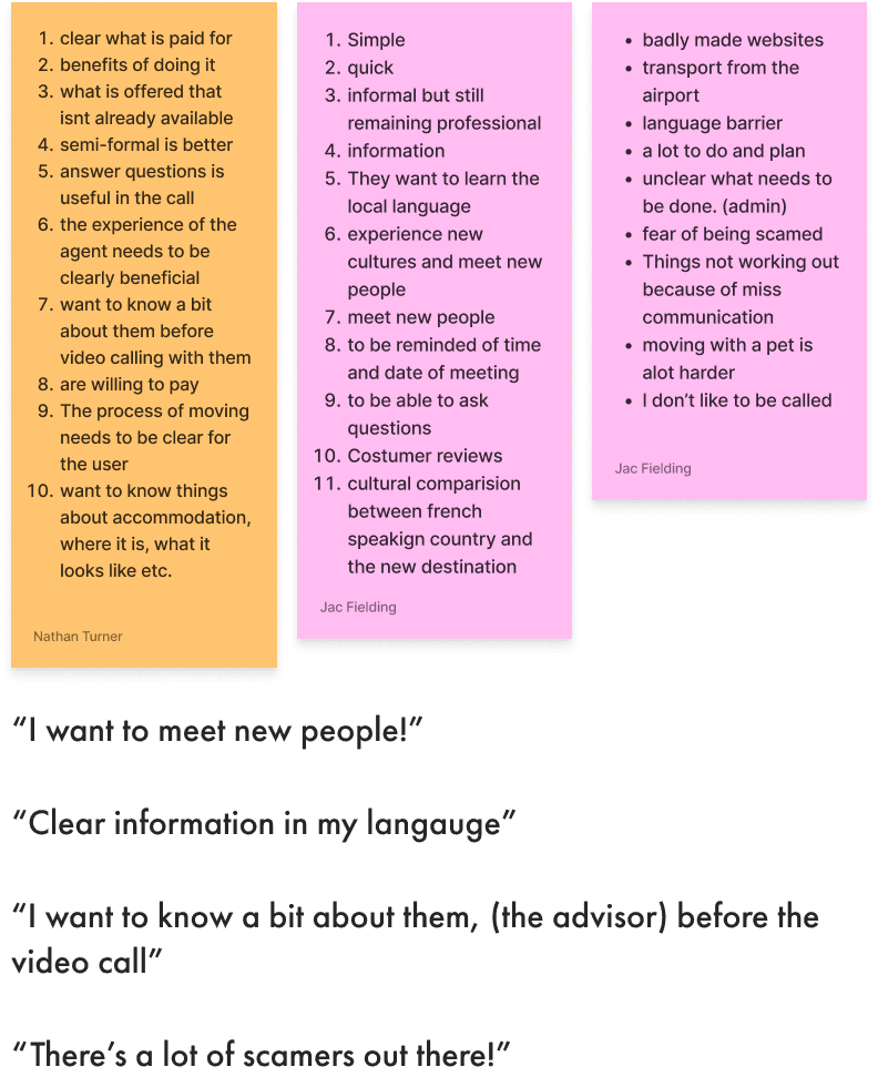
One interesting response we had was that a third of people said that they would be extremely unlikely to book a video call with a local expert, this is something we obviously needed to talk about more in our user interviews.
Then as went further into this matter in the user interviews we found out that people actually were willing to have a video call with a local expert, but they wanted to know a little bit more about that person first.
Affinity Diagram, the feedback.
Location and accommodation were the most important things to the user in general.
The users wants and needs:
Semi-formal communication.
To know what is free and what is not.
What the agent can do that they can’t do themselves.
Avoid scams.
The users often report a friend or someone who helped them with their relocation, this person is often a very important part of the users story and something we need to focus on in our project.
User Persona & User journey map, who are we helping?
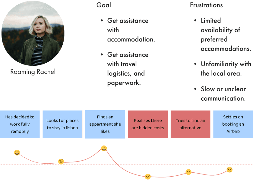
Rachel aims to secure accommodation before arriving in Lisbon.
Her journey involves struggling with a language barrier when negotiating with a landlord, resulting in hidden costs, and settling for an expensive Airbnb.
Usability heuristics for UI design, what needs to be changed?
The complicated, mandatory fields in booking a local expert cause users to abandon the process.
No error feedback confuses users.
Problem Statement, what problem are we going to solve?
Users are struggling with the Remoters website's booking process for video calls with local experts. The difficult process is causing frustration and leading to low sign-up rates.
How might we statement.
How might we encourage Rachel to trust a local expert and book a video call with them so she can gain the necessary information to move with minimum stress.
Concept & Low-Fi, ideation.
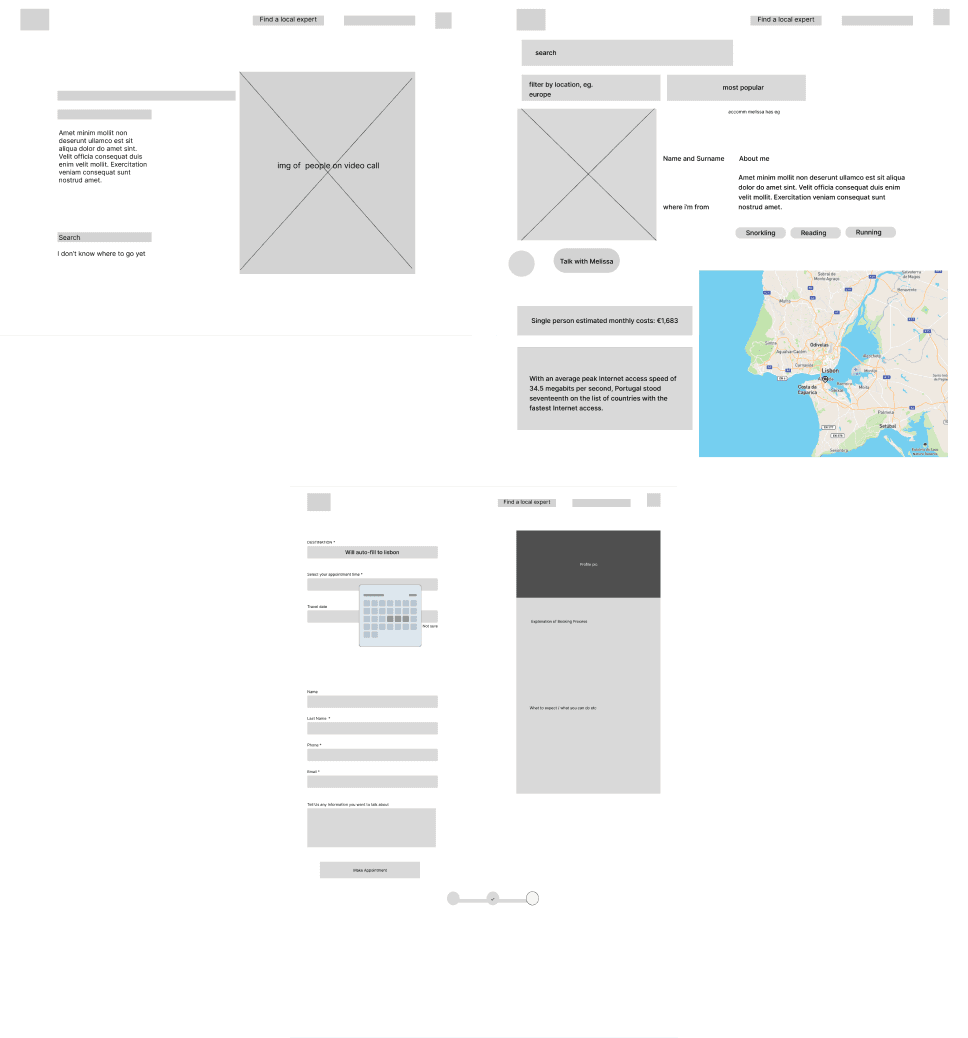
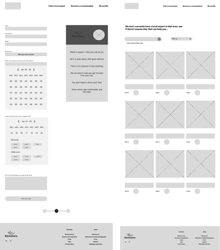
We reorganised the website's features to prioritise user needs and streamlined the booking process onto one page.
A "Find a Local Expert" page was added to provide destination and information on the expert themselves.
Concept testing & Mid-Fi Prototype, are we closer?
Concept tests revealed that the "Find a Local Expert" page needed to focus more on the place and less on the expert.
We improved the layout of the booking system and calendars.
We also moved the login page to when the user clicks to book a call to reduce potential abandonment during the process.
High Fidelity, our final designs.
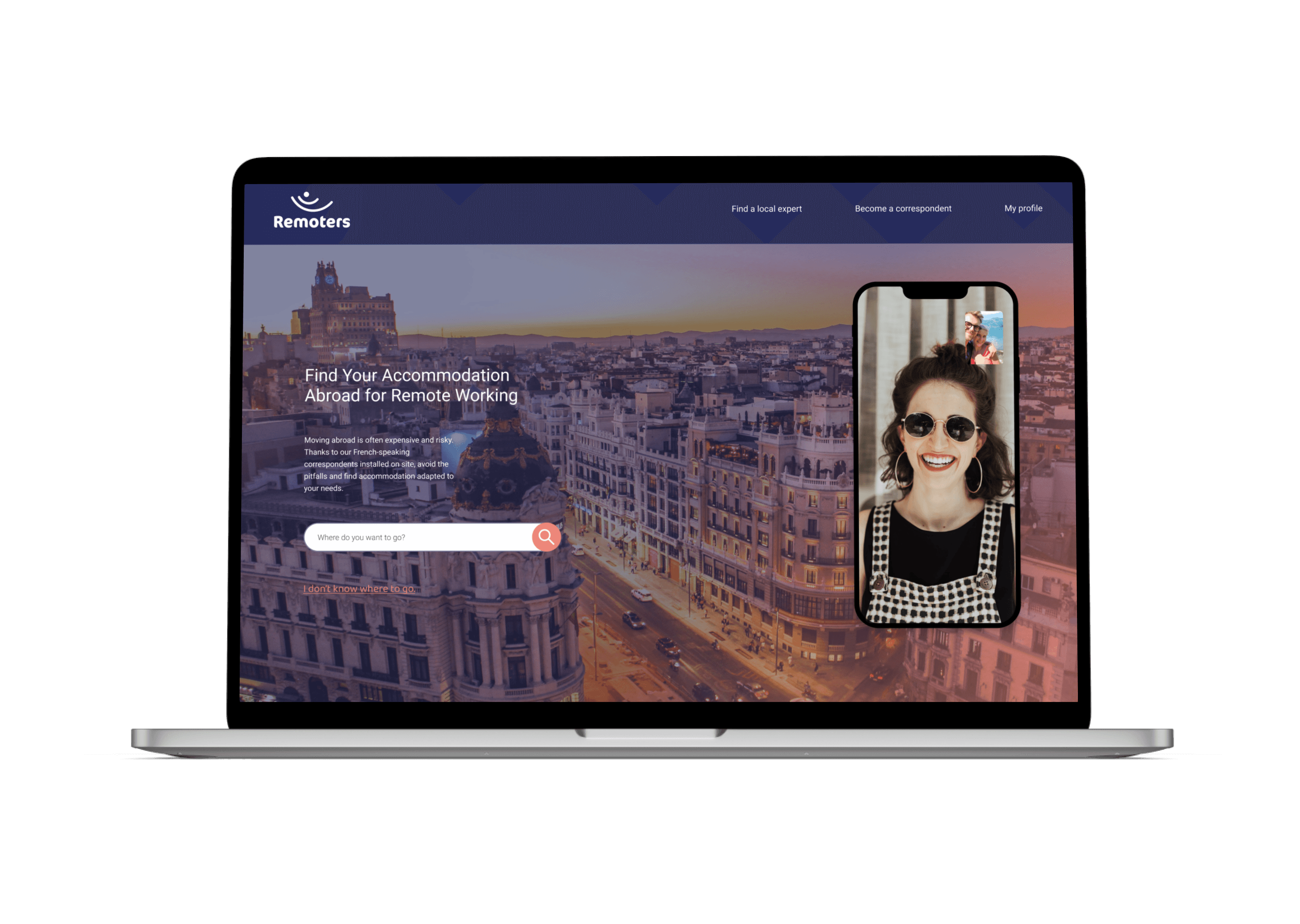
We designed a modern, intuitive interface with pink hover states and prominent pink call-to-action buttons for clear user feedback.
